
(*Affiliate links used whenever possible at no extra cost to you.)
Hey friends! Today, I’m sharing an accompanying blog to my social media post featured on Scrapbook Pal’s IG feed. This card was so fun to make so I thought I’d write out some instructions in case anyone wanted to do something similar. I reached into my stash and mixed and matched items from previous Spellbinders releases for this design. I have so many items that I’ve never used and I need to change that!
Main products used:
Spellbinders – Floral View Press Plate
Spellbinders – Parcel & Post Mailbox
Spellbinders – Autumn Wonder
Spellbinders – Sentiments of Wonder Press Plate and Die set
STEP-BY-STEP INSTRUCTIONS
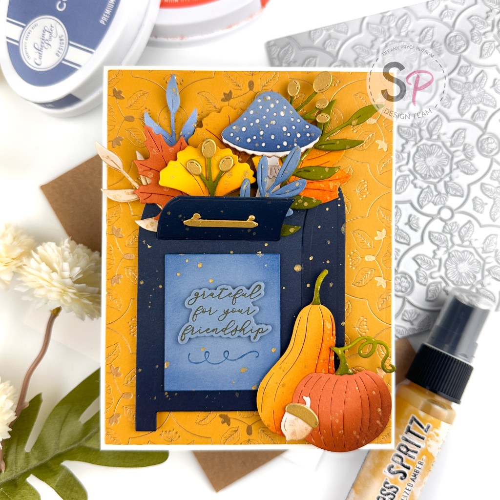
- Choose a color palette – I used a combination of Spellbinders (Cream, Partly Cloudy, Indigo, Sunkissed, Tuscan, and Brushed Gold) and Concord & 9th (Spiced Cider) cardstock colors. I love the modern fall vibes from this color combo.
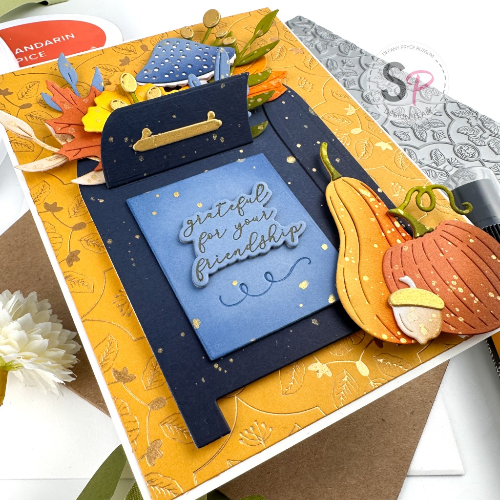
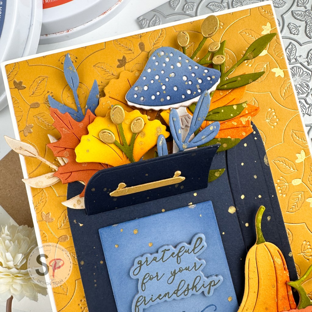
- To create the background, hot foil the Floral View Press Plate on Tuscan cardstock with Satin gold glimmer foil. The result almost has a tone on tone look and it is so pretty! I’ve never used this plate before and I will certainly use it again in the near future. Tip: In my opinion, press plates foil much, much better than regular hot foil plates.
- Die cut the foiled background with the basic A2 dies for a clean edge. And matte the panel with an A2 sized panel of Cream cardstock.
- After the background is complete, die cut all the pieces for the mailbox, leaves, squash, etc. that will be the focal point of the card using Parcel & Post Mailbox and Autumn Wonder sets. I die cut a variety of items using the cardstock colors in my chosen color palette.
- To add additional depth to each die cut, I ink blended a coordinating Catherine Pooler dye ink color. I love so many ink brands, but Catherine Pooler is one of two lines that I own the full set. For example, on the pumpkin that I die cut from Spiced Cider, I ink blended Gingerbread ink on the side and for the mushroom die cut from Partly Cloudy cardstock, I ink blended Cove Blue on the bottom. The full list of ink colors I used are: Mandarin Spice, Eucalyptus, Sauna, Gingerbread, and Cove Blue.
- After ink blending, I used Fossilized Amber Distress Spritz for splatter over all the die cuts. Distress Spritz is so pretty and perfect for a little extra shine on your projects.
- I adhered all of the die cuts down with either foam tape or liquid glue for varied dimension in and around the mail box. It is so cute that the mailbox opens up so you can stuff any die cuts inside.
- For the sentiment, I die cut a square from Partly Cloudy cardstock and used the Sentiments of Wonder Press Plate to press a little flourish at the bottom. I also pressed and die cut the sentiment and adhered it above the flourish. I used the Regal Tones mini ink set for the sentiment (Bark) and the flourish (Cosmic Sky).
That’s it! I hope you were inspired by this card. Tag me on IG if you create something similar. I love to see what you create. 🙂
Happy crafting,
Tiffany
I’d love to connect with you! Please follow me on IG and my blog, and reach out and say hi!
@ink.therapy.designs
*Affiliate disclosure: I only use, review, and blog about products/companies I actually like and will continue to use. Some of the products shown on my blog use affiliate links. These affiliate links allow me to earn a small commission when products are purchased through those links. *This is at no cost to you!* Please do not feel obligated to use my affiliate links. If you choose to use these links, thank you so much! It helps support my blog and bring new content to you. Read the full disclosure on the about page.
