Project Overview
- Technique(s): watercoloring, layered stamping, floral arrangement
- Product list:
- The Greetery, Hoop & Fringe Die
- The Greetery, Catching Snowflakes Die
- The Greetery, Hoop Wreath Stamp & Die
- Catherine Pooler inks, variety of colors
- Kuretake Starry Colors

I’m back with a card made from the newest release from The Greetery, Winter Wanderer! Y’all, this release is drop dead gorgeous! I love the playful mix of boho, winter glam. There are endless possibilities to create stunning cards so I hope after reading this, you’re inspired to pick up a few new products for yourself!


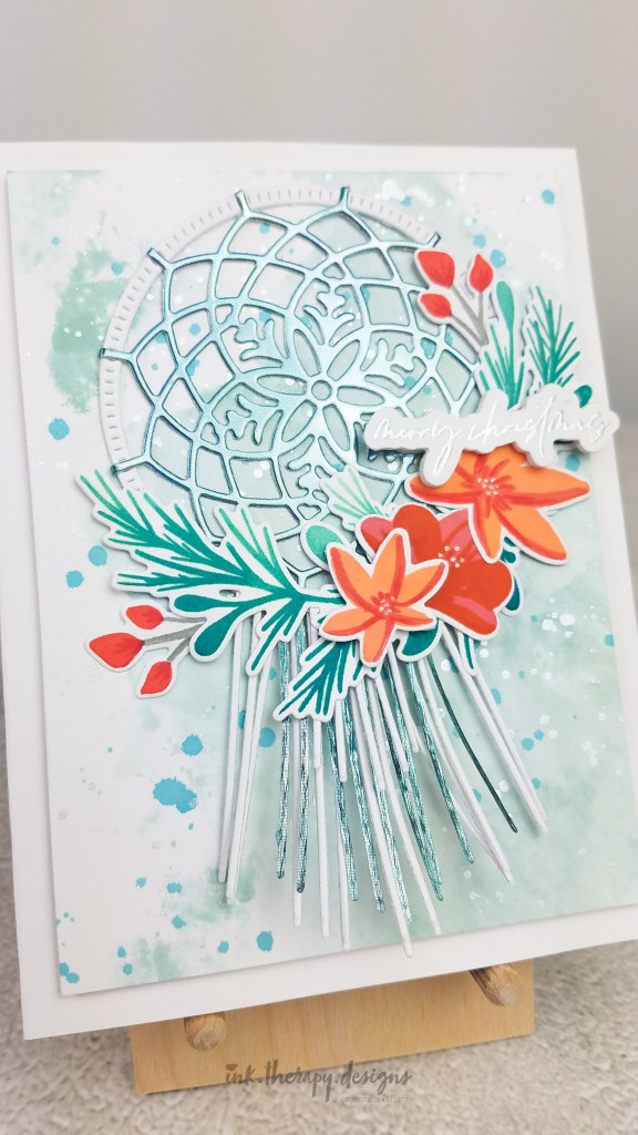
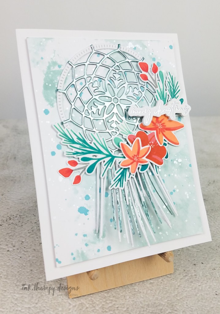
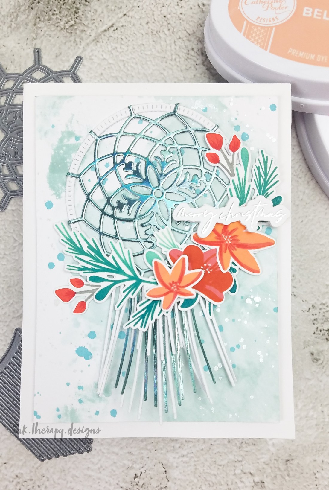
Background. To create the background, I used the ink smooshing technique with Catherine Pooler inks, Hot Tub and Daydream. I then splattered the panel with CP ink, Twilight and silver metallic paint from the Starry Night palette (my favorite metallic watercolor palette!). I did the watercoloring in layers to build up depth and variation in color. In my Hey Winter blog post, I mentioned using a new (to me) heavyweight cardstock for the first time and wanting to try watercolor techniques on it. Well, I used that cardstock for this card and it held up ok. The paper did warp so I’m not sure it could take much more water than ink smooshing or a splatter. After coloring, I set aside the panel to dry completely.
Hoop Wreath. Out of heavyweight white cardstock and Erin Lee Creative Holographic Cardstock, I die cut the hoop, the snowflake die, and the accompanying fringe. There is a small, medium, and large fringe die cut, so I thought cutting the medium/mid layer out of the holographic cardstock would help to better “mix” the white and holographic fringe. The snowflake die combines with the hoop die beautifully. The spokes are long enough to wrap and get glued behind the hoop for a more finished look. I chose the background colors intentionally to help tone down the holographic color a bit. I wanted the bright florals to stand out the most.
Florals and Greenery. The flowers in the Hoop Wreath stamp set are so pretty. Most of the stamps are meant to be layered and they are labeled so you can easily tell which layers go together, which is nice. I am loving non-traditional holiday colors so I paired orange/persimmon florals with my teal/green background. I love complementary colors because the contrast is striking and visually interesting. I added some copic marker on each flower for a little extra depth and a silver gel pen in the centers. For the large greenery branch, I used a variety of ink colors to create a slight ombre effect.
Pro tip: Find ways to add depth and interest to your floral stamps and die cuts! Layering stamps are oftentimes very beautiful and have a lot of detail already, but I recommend punching it up a notch with some additional layers of copic marker, colored pencil, or gel pen. Mixing multiple ink colors on the same stamp layer can also create lovely depth. I really appreciate the little details in cardmaking; it’s what makes our art mini masterpieces.
Final assembly. After the background panel was dry, I ran it through my die cutting machine a couple times to flatten. I add fun foam for dimension and glued it to a white card base. I arranged and glued the florals onto the hoop, and then adhered the hoop onto the background panel with liquid glue. Lastly, I silver heat embossed the sentiment and cut it out with the coordinating die. It’s so convenient having the coordinating die with these fine lined sentiments.
If you liked this, please stay tuned! I have several more cards in the works with this release. If you’re inspired by my design, I’d love for you to follow and tag me on IG; I can’t wait to see what you create. Thanks for stopping by and happy crafting!
.Tiffany.