
Project Overview
- Technique(s): die cutting, pattern play
- Product list:
- Waffle Flower Winter Floral Panel Die
*As of writing this, it is out of stock currently on the Waffle Flower website, but Ellen Huston has it in stock. - Waffle Flower Christmas Stripes Paper Pad
- Waffle Flower Dots & Lines Sampler
- The Greetery Merry Sprigs Stamp Set
- Waffle Flower Winter Floral Panel Die

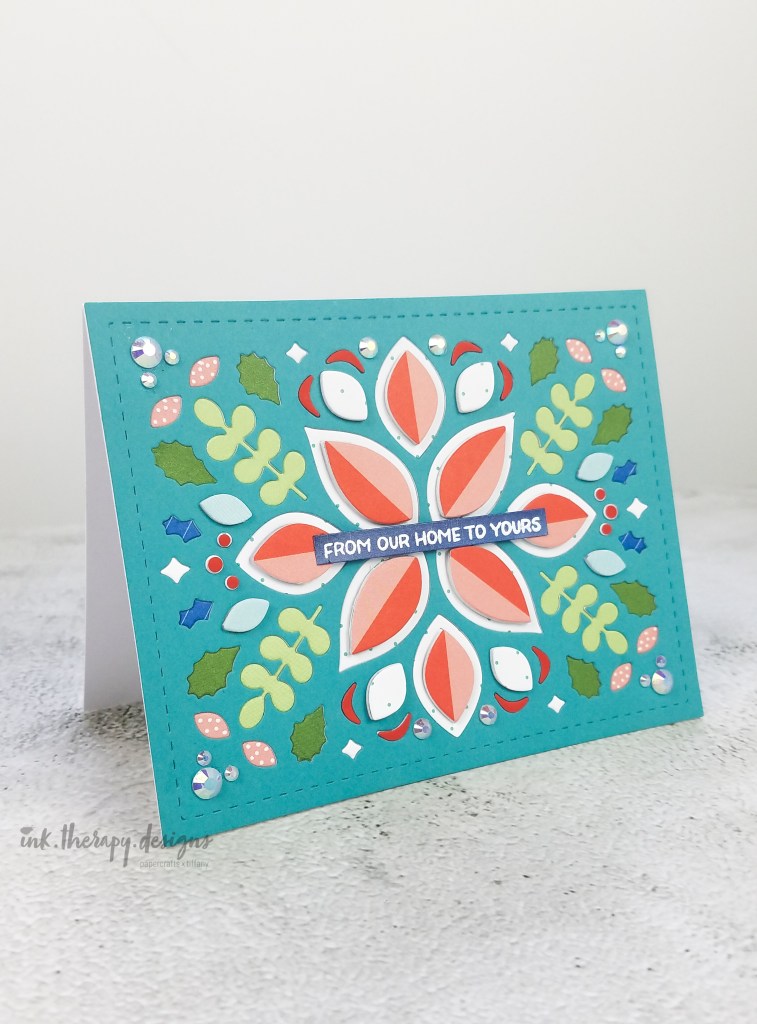
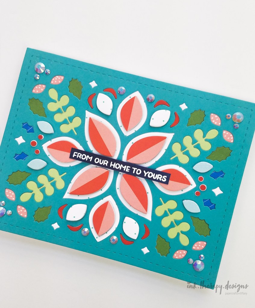
Call me butter ’cause I’m on a roll this week! A Waffle Flower week that is! I’m having so much fun playing with new (to me) products in my stash. In honor of Simon Says Stamp’s #Diecember, I created this all (nearly all) die cut card using Waffle Flower’s Winter Floral Panel Die. I love how whimsical the final design is. Full disclosure – this project took all night so I wouldn’t recommend this particular design for making multiples. But for your favorite family member or your best friend, this is perfect! (To whichever family member or friend who is reading this and did not receive this card, I love you, I promise!!) Of course, you can simplify the design to speed up creation – the Winter Floral die is beautiful and versatile! I purposely created this card in a horizontal orientation to show that it can work in both a top folding or side folding design.

Before diving into how I made the card, I wanted to give a few tips on color if you are new to cardmaking or if you have trouble creating a color story. I think using some simple tips from color theory go a long way to ensuring your final design is cohesive. Disclaimer – I’m not a master color theorist, but have picked up a few things since starting my crafting journey. I also am a rule breaker, so please feel free to deviate from the tips below. Do what makes you happy and works for you and your style. That’s the beauty of art!
Tip: Use the “gallon/quart/pint” rule to create a balanced color story or visual. You will use a “gallon” of one or two colors, smaller amounts of another couple colors, and finally hints of your last color(s). For this card, my gallon colors were teal and pink/dark pink, quart colors were white and green, and pint colors were red and blue.
Tip: Choose a primary color palette, but use lighter and darker tints/tones to expand the color palette. The primary colors – red, yellow, and blue – make for a great starting palette. Choosing tints or tones with your primary colors expands your color options. Traditionally tints and tones are referenced in regards to mixing paint colors, but the concept still applies to paper color. Tints result when you add white pigment to desaturate and lighten the color. Pastel colors are an example. Tones result when you add gray to saturate, but dull and darken the color. While I did not use all primary colors, I did use tints and tones to add variety and contrast. You can see that in the blues and greens that I used.
Tip: Try using analogous colors in your color palette for an easy, harmonious design. Analougous colors are right next to each other on the color wheel – think red/orange or green/blue. In my card, I used analogous colors of blue and green to add interest.
Tip: Don’t forget to add neutral colors in your design – white, black, or gray – to give your eyes a chance to rest. Neutral colors can be really impactful in a very colorful design. I used the white polka dot paper to break up the colors and add focus to the center sentiment.
There are several other color theory tips, but let’s save some for another day. If you want to learn more, here is a great Intro to Color Theory Class or simply google. After my color story was done, all that was left was the die cutting – the task that took the longest. On an A2 sized panel of lightweight, white cardstock, I adhered a die cut panel of teal cardstock. The only time I die cut an entire panel with the Winter Floral die was when I cut the teal cardstock. Every die cut piece I in-laid after, was “cut to order” (so to speak). Using several pieces from my paper scrap collection, I cut scraps down so it was just big enough to cover the element I wanted in that color. I did this repeatedly until all pieces were die cut and in-laid. On the main petals, I added fun foam for dimension.
Embellishment and sentiment. To add sparkle to the card, I added some iridescent jewels to replace the in-laid circles around the perimeter of the card (I’m sorry I can’t remember which company I bought them from). I white heat embossed the sentiment from The Greetery on blue holographic cardstock from Erin Lee Creative. I chose to use the holographic paper because it mimicked the iridescent jewels perfectly. Note: careful when heat embossing this paper. I found that the heat started to separate and curl the blue holographic top coat from the white cardstock it was adhered to.
That’s it! My fun, whimsical, folksy holiday card is done! If you’re inspired by my design, I’d love for you to follow and tag me on IG; I can’t wait to see what you create. Thanks for stopping by and happy crafting y’all!
.Tiffany.

